
Understanding golfity's Charts and Graphs
golfity turns your rounds into a handful of charts and graphs. Learn how to read each one, from the direction of a strokes gained bar to the color of a scorecard cell, and every visualization becomes a practice cue.

golfity does not hand you a spreadsheet. It turns each round into a small set of golf analytics charts, and once you know how to read them, a five-second glance tells you where the round was won or lost. Every graph in the app uses the same visual grammar: color for good versus bad, direction for gained versus lost, length for how much. Learn that grammar once and every chart in golfity reads the same way.
The strokes gained bar chart
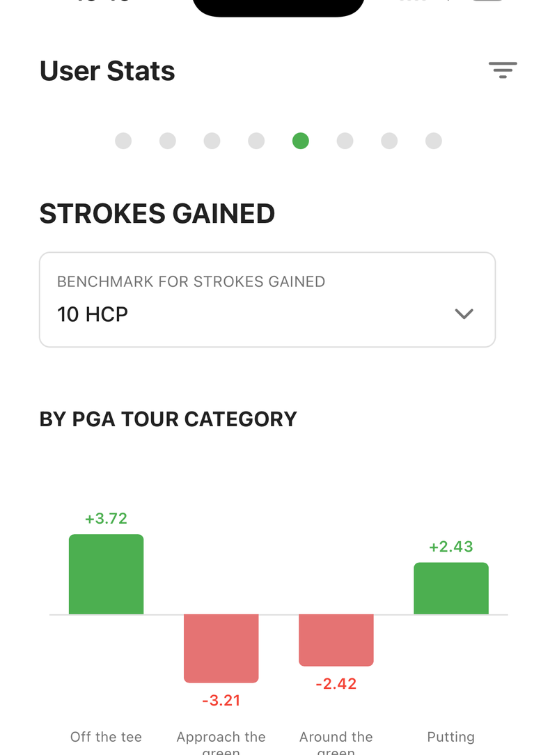
The chart that sets golfity apart is the strokes gained bar chart, built on Mark Broadie’s four categories: off the tee, approach, around the green, and putting. It appears on any round you track shot by shot.
Read it by direction. A bar stretching right means you gained strokes against your benchmark in that part of the game; a bar to the left means you lost them. The length is the size of the swing, so a putting bar reaching -2.1 cost you more than an approach bar sitting at -0.4. The chart labels the benchmark it compares you to, whether that is the PGA Tour or a handicap level like “10 hcp.” If the numbers are new, start with how to read your strokes gained numbers.
The habit is simple: find the longest left-facing bar and let it pick your next range session.
The scoring distribution graph
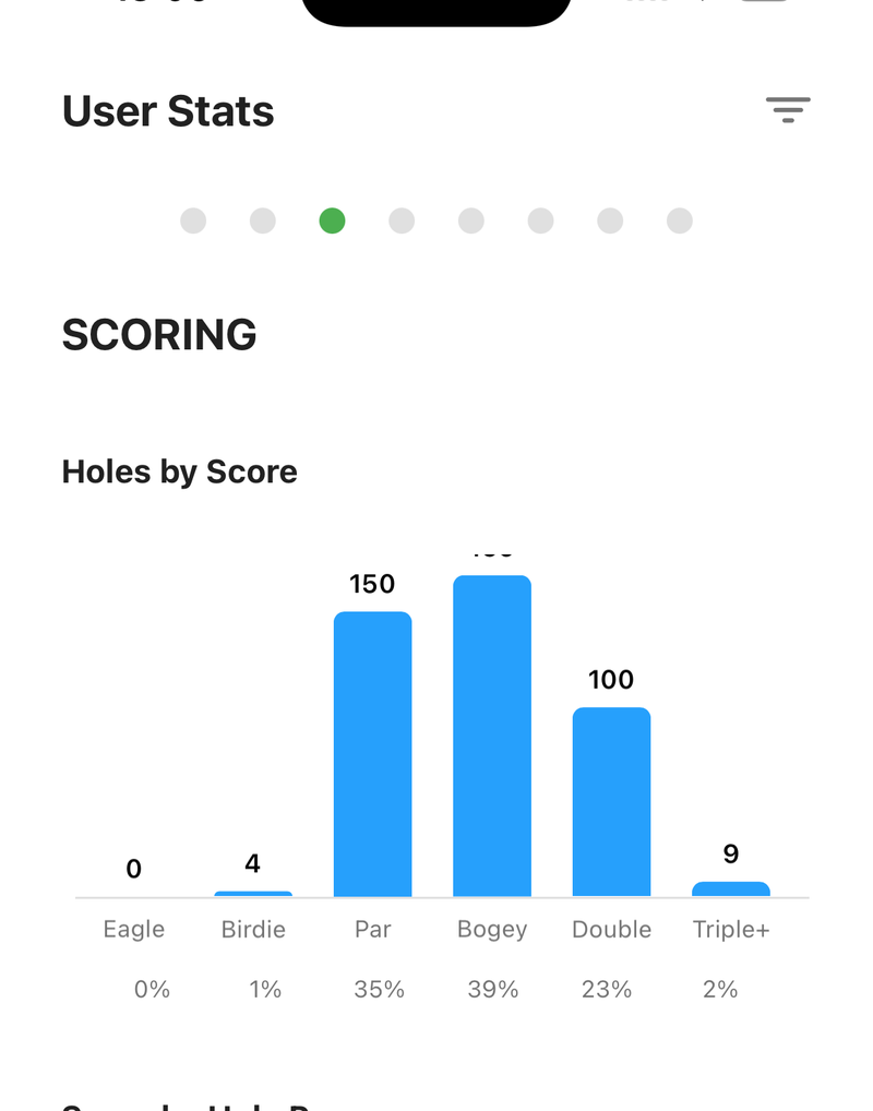
The scoring page answers a different question, and it uses a plain bar chart to do it. Each bar counts how many eagles, birdies, pars, bogeys, and doubles-or-worse you made. Tall bars on the right side of the chart mean the big numbers are piling up, and a fat doubles bar usually explains a round more honestly than your handicap does.
Below it, golfity breaks scoring down by hole par. Seeing your par-3 average next to your par-5 average as separate figures catches most golfers off guard, because par 3s tend to leak strokes that par 5s quietly give back.
Putts by distance
Putting gets its own visualization, and it is one of the most useful in the app. golfity charts how many holes were one, two, or three putts, then lays out a table of putts by the distance of your first putt.
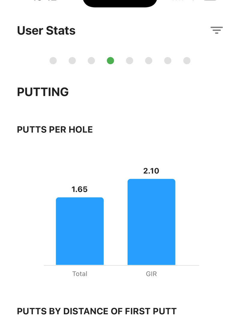
That distance table is where a vague complaint like “I putted badly” turns specific. Three-putts clustered from 40-plus feet point to lag speed; three-putts from inside ten feet point to your stroke. Those are two different practice sessions, and the graph tells you which one you need. The same logic runs through our guide to reading your round summary.
The color-coded scorecard
Not every visualization is a bar. The enhanced scorecard is a heatmap. Each hole carries a strokes gained value per category, and each cell is shaded green where you gained and red where you lost, with deeper shades marking the bigger swings.
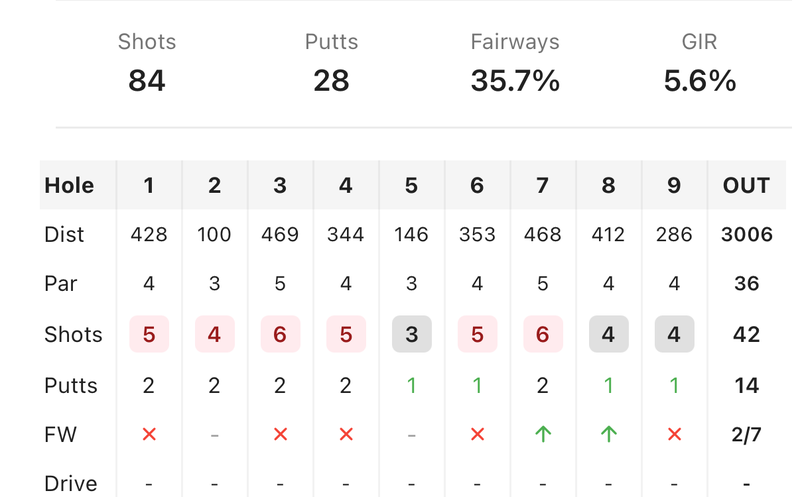
Read it as a pattern, not a table. A vertical run of red down the off-the-tee column tells you driving cost you the round; a red streak across the back nine hints at fatigue or a mental unravel. Tap any cell for the exact number, which separates a harmless -0.1 from a -1.5 that deserves your attention.
Trends across the stats tab
A single round is a data point. The stats tab is where golfity stacks your history into trend charts, so you can watch a category climb or slide over weeks rather than react to one bad afternoon. This is where data visualization earns its keep: a putting line drifting down over ten rounds is a real signal, while one poor putting round is just noise.
Use the trends to confirm what the single-round charts suggest. If your approach bar is red three rounds running and the trend line agrees, that is your winter project, not a one-off.
Why the same grammar everywhere helps
Because every golfity chart shares the same rules, you stop decoding and start reading. Green and right are good. Red and left cost you. Length is magnitude. That consistency is the point of good golf analytics charts: the graph should surface the answer before you have to think about it.
Track a few rounds shot by shot and the visuals fill in. To compare these charts against friends, the compare feature puts two players side by side, and the features page covers the rest of what golfity tracks. The charts do the reading for you, so the only job left is to work on the reddest bar.